Refilled is an Australian startup on a mission to eliminate 100 million single-use plastic bottles by 2030. Their bring-your-own-bottle Refiller machines dispense still and sparkling water with over 100 flavour combinations and optional boosters — helping people make sustainable choices without compromise.
From Prototype to Product
By the time I came on board, Refilled already had proof of concept. A bright-purple Refiller machine at a Sydney university was dispensing still and sparkling water with custom flavours and boosters daily. It was colourful, loud, and fun — and students were refilling bottles happily without any prompting.
The next step seemed obvious: build a mobile app to deepen engagement. If users could track their environmental impact, earn rewards, manage payments, and find nearby machines, that would surely build stronger habits and a more connected product experience.
But early data told a different story. People were refilling happily without ever opening the app. And conversations with prospective customers revealed something important: many of the most likely adopters would be businesses — offering free refills to employees, students, and visitors as part of broader sustainability and wellbeing initiatives. The person paying for the machine and the person using it were often entirely different people, with entirely different needs.
That insight reframed the product direction. The opportunity was not to extend the experience through another screen. It was to simplify it right where the action happened — at the machine itself.
Designing around what actually worked
We reorganised the design focus around three core ideas.
Make refilling feel effortless
The core action should take less than twenty seconds, start to finish. Any friction in that flow was friction against the whole proposition.
Keep flexibility built in
Machines could be free-to-use or paid depending on the customer — a workplace offering a staff benefit operates very differently from a public installation. The design needed to accommodate both without feeling compromised in either.
Make impact visible
Small actions needed to feel like shared wins. On-machine visuals and simple leaderboards brought the gamified, purposeful tone of the app into the physical experience without adding steps to the flow.
Designing the launch-ready Refiller
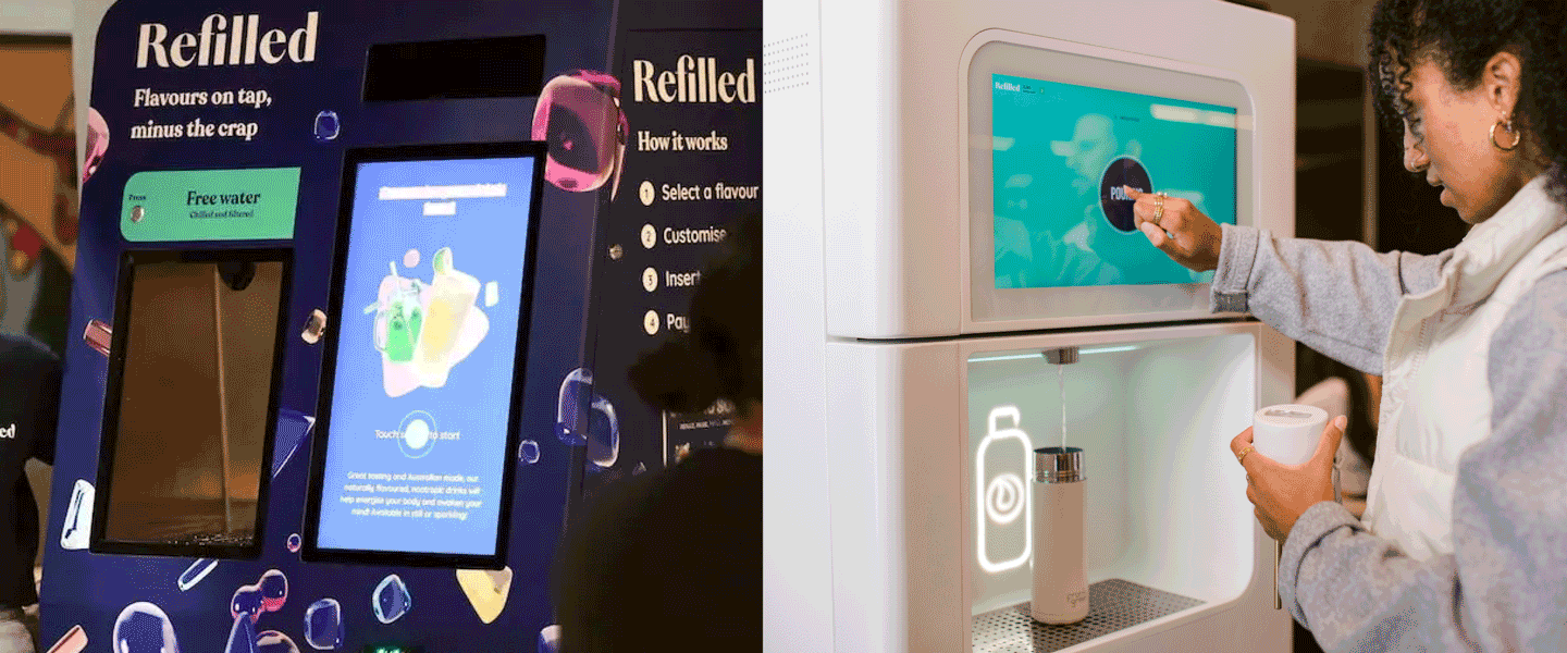
The beta machine had personality in abundance — vibrant, playful, and full of energy. But that aesthetic wasn't right for every environment, and Refilled was now targeting workplaces, universities, and public spaces that required something calmer and more considered.
When Refilled rebranded, we used it as an opportunity to create a cleaner interface that reflected their new identity while still carrying the warmth and purpose of the original. The refill flow became a single-screen, four-step journey: size, still or sparkling, flavour, booster. Each step provided immediate feedback and felt intuitive — more tap-and-go than vending machine.
Payment was deliberately deprioritised but kept ready. Contactless pay-per-use remained available for the right contexts, but most businesses chose to offer free refills. The system stayed flexible — invisible when not needed, effortless when it was.
Iterative development across the beta period had created some drift between the Refiller interface, the mobile app, and other brand touchpoints. Aligning typography, colour palette, and tone of voice through the new brand system was essential to bring the experience together as a coherent whole — something that could represent the brand confidently wherever it appeared.
From pilot to rollout
The refined experience gave Refilled the foundation to move confidently from beta to commercial rollout. Refiller machines are now installed across workplaces, universities, and community spaces including Meta, Atlassian, Google, and Greenhouse Tech Hub — with the design system creating consistency across every physical and digital touchpoint.

Refilled didn't need more — it needed to be distilled. The most valuable design work on this project was figuring out what to stop doing, so that what remained could actually shine.
