Dicksticker is an Australian swimwear brand on a mission to clean up our oceans. By transforming reclaimed ocean plastics into high-quality men's swimwear, they offer a bold,"wild side" aesthetic without the environmental compromise.
We're capturing an early snapshot — reflecting on the audit, the design decisions, and the first thirty days of live data following Stage 1 rollout. The signals are promising, but this is the beginning of a longer story. I'll update this post as Stage 2 progresses.
Uncovering the performance floor
The audit told a clear story. The website had not been meaningfully updated in years, and the gap between the quality of the product and the quality of the experience was significant. Traffic had been declining for months. Sessions were sparse and disengaged. The bounce rate sat above 80% — visitors were arriving and leaving almost immediately. Checkout abandonment was effectively total.
The issue was not the product. Existing customers loved it. The issue was trust and friction — a website that felt unfinished to anyone encountering the brand for the first time. A desktop navigation hidden behind a hamburger menu. No clear articulation of what made Dicksticker worth choosing. Product pages that lacked the information and confidence a new customer needs to commit.
The data suggested latent demand — people finding the site, showing some interest, then leaving before the experience could convert them. The opportunity was not to rebuild from scratch. It was to remove the barriers that were getting in the way.
Performance-first, planet second
One of the more important strategic shifts came in how the brand led its messaging. Sustainability is genuinely at the heart of what Dicksticker does — but for a new visitor, the primary question is simpler: is this swimwear I actually want to wear?
We switched the messaging hierarchy to lead with performance, quality, and the boldness of the brand, with sustainability reframed as a high-value by-product of a purchase the customer already wanted to make. That shift unlocked a tone that was more honest to the brand anyway — confident, a little cheeky, and direct:
"Swimwear for your wild side" "Bold by nature. Sustainable by design." "Bold prints. Built for comfort. Made from recycled ocean plastics."" Dickstickers out in the wild" — social proof with personality
The brand had always had this energy. The previous messaging just was not letting it through.
Precision UX over general overhaul
A full Shopify rebuild would have taken months and delayed any results. Instead, we took a lean approach — identifying the highest-impact changes that could be implemented quickly within the existing theme, and focusing entirely on those.
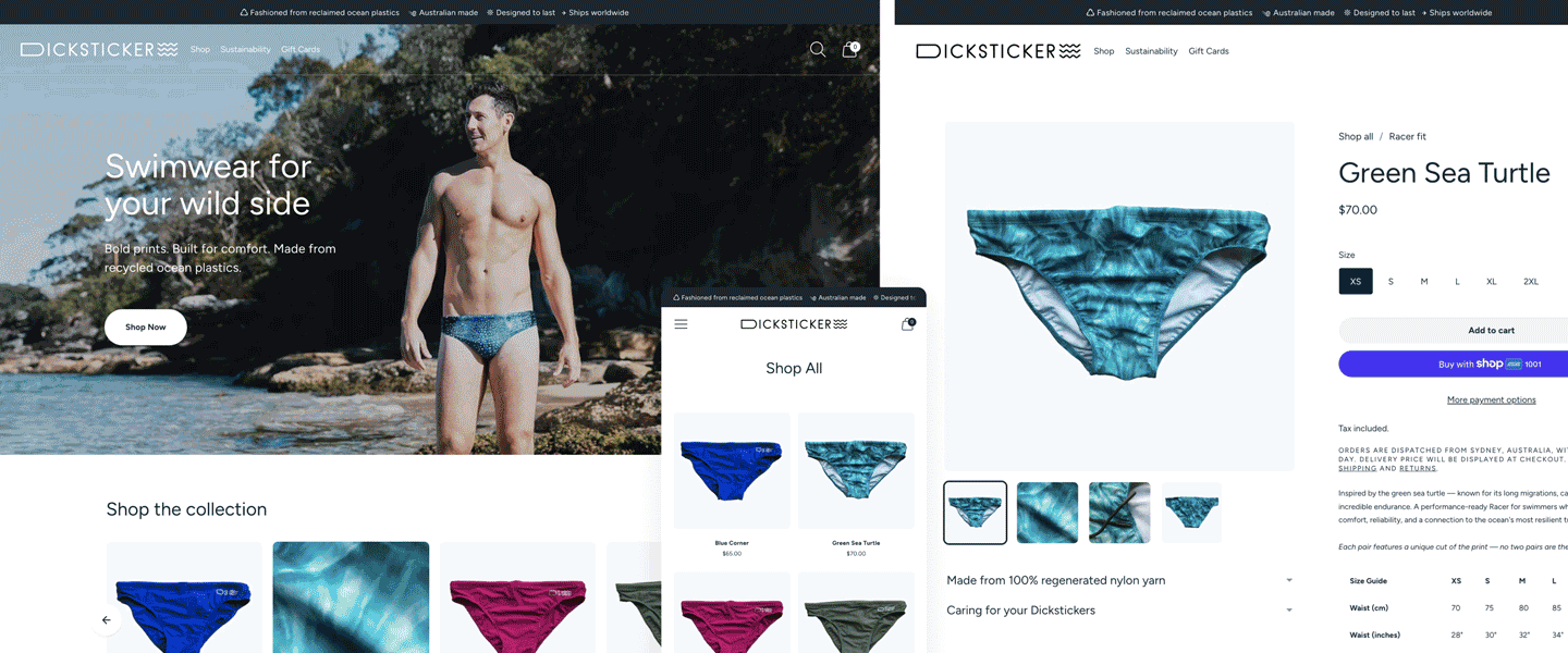
Mobile-first
Audit data showed the overwhelming majority of visitors were on mobile. A shift from a single-column to a two-column product grid immediately got more products above the fold, reducing the effort required to browse.
Navigation clarity
Key links were pulled out from behind the hamburger menu, the footer was reorganised for discoverability, and low-value clutter — including an account login that served no purpose at this stage — was removed.
Product hierarchy
Breadcrumbs were introduced for easier navigation, products were given clear fit categorisation and labelling, and product specs were templated so that the information a buyer needed was always in the same place and easy to find.
Layering the trust signals
For a brand without wide awareness, trust has to be built deliberately — and at every touchpoint. We approached this in layers.
A top banner was added highlighting Australian-made quality, reclaimed materials, and international shipping — anchoring the brand's credibility before a visitor had scrolled anywhere.
Product photography was updated where available to showcase fabric detail and quality through better flat-lays and lifestyle imagery — giving new visitors a clearer sense of what they were actually buying.
An Instagram feed and refreshed testimonials were added to surface the real community of Dicksticker customers — social proof that the brand had genuine fans, not just a Shopify store.
An FAQ page and cleaner product descriptions rounded out the trust layer — giving first-time visitors the information they needed to feel confident, rather than leaving them to guess.
Getting eyes on the brand
Alongside the UX work, we activated a small paid social campaign — the first meaningful marketing Dicksticker had run in a long time. Brand awareness had been an ongoing gap; the product existed, the community existed, but new audiences had no reliable way of finding either.
We began by testing several ad formats: static images, reels, and carousel ads. The static format with the "Bold by nature. Sustainable by design." line performed strongly almost immediately. A reel format also proved compelling. Over the first two weeks we tested variations of each, then distilled the spend down to the three best-performing formats and put a little more behind them.
It was a modest budget — deliberately so at this stage. The goal was to learn what worked before scaling, not to spend aggressively on untested creative.
What the first thirty days showed
The early signals were genuinely encouraging, with some clear areas flagged for Stage 2 attention.
On the positive side
Traffic surged, with sessions increasing more than fourfold compared to the pre-launch baseline. The bounce rate dropped by nearly 38% and held — a sign that the redesign was engaging visitors rather than immediately losing them. Mobile performance was particularly strong, with a 47% bounce rate compared to over 80% on desktop. Add-to-cart rates tripled and held at approximately 3% across the month, indicating that visitors were moving deeper into the funnel. Revenue increased significantly in the first two weeks, and while it softened in the second half of the month as the proportion of first-time visitors grew, the overall direction was positive.
The nuance
85% of visitors in this period were new to the brand — which is exactly what the ad spend was designed to produce, but it also means the site is currently converting a largely unfamiliar audience with limited trust history. Cart abandonment worsened over the full month, and checkout abandonment remained high. Desktop sessions, which made up around 14% of traffic, produced no conversions at all.
These are not surprises — they are the expected shape of a brand building awareness from a low baseline, encountering the trust-conversion gap that comes with a predominantly new audience. They are also a precise brief for Stage 2.
What comes next
Stage 2 is focused on closing the gap between the visitors the brand is now attracting and the conversions the experience needs to generate.
Trust and conversion mechanics for first-time visitors — reviews, guarantees, and security signals that give unfamiliar audiences the confidence to complete a purchase.
Cart and checkout recovery — smart abandoned cart flows beyond Shopify's default, exit-intent interventions, and a streamlined checkout experience designed to reduce drop-off.
Email ecosystem — a welcome series for new subscribers, an advanced abandoned cart sequence, and a post-purchase flow to build loyalty and encourage return visits. The goal is to turn the audience being built through ads into a community that stays engaged.
Desktop experience — with zero desktop conversions across the month, there is a clear and addressable gap. The mobile-first approach was right for Stage 1. Stage 2 will bring the desktop experience up to match.
Ad refinement — continuing to optimise the three performing formats, with a gradual increase in spend as the conversion mechanics improve to support it.
The foundation is working. The next phase is making sure it converts.
